Capstone Vineyards
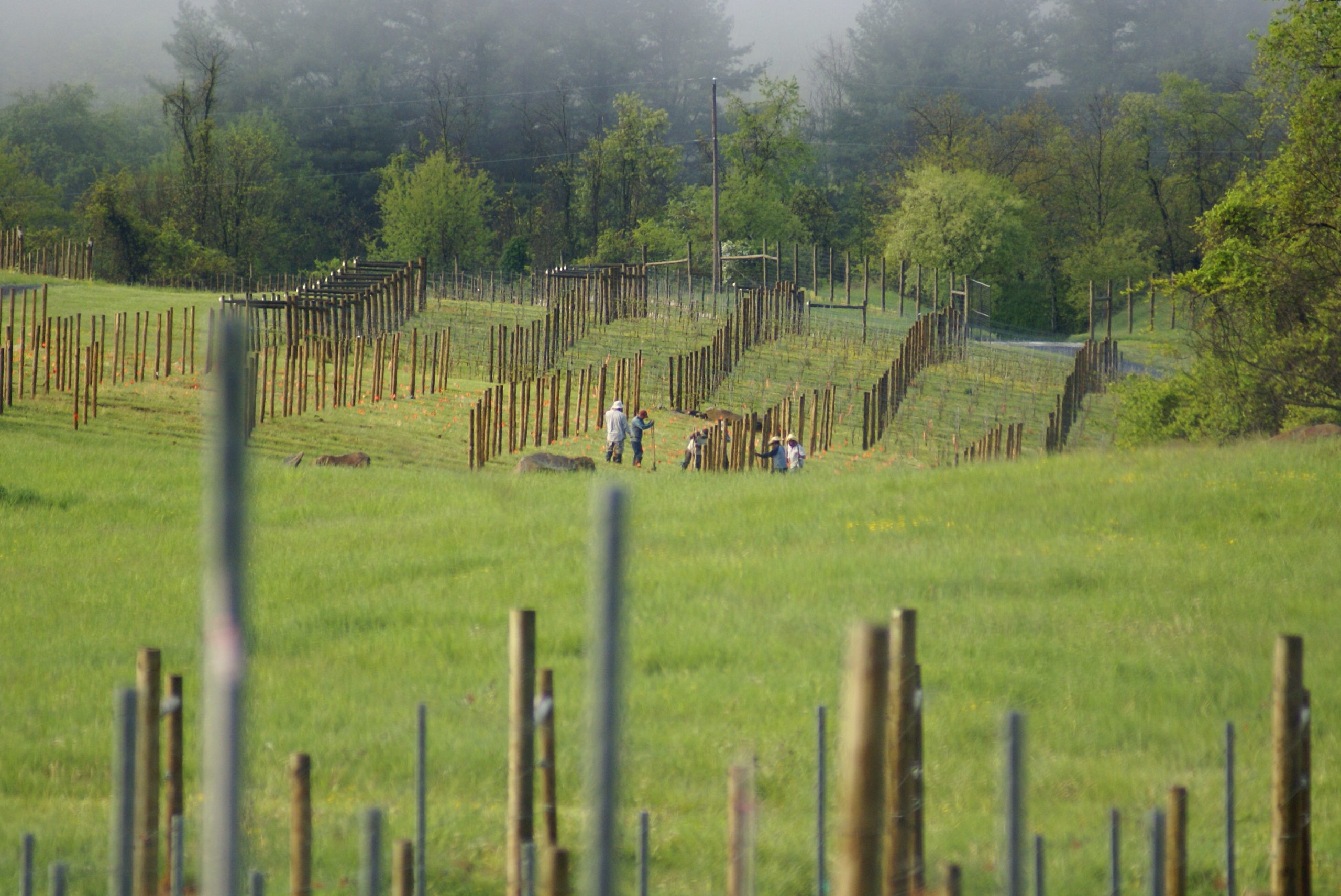
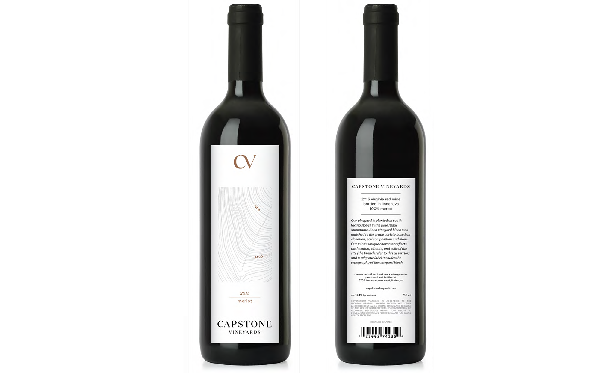
Capstone Vineyards was looking for a simple, refined identity to match the future vineyard. The owners were going to be hands on from when they planted the vines to when they bottled the wine. They were proud of the land they chose and were focused on creating wines that reflected that.
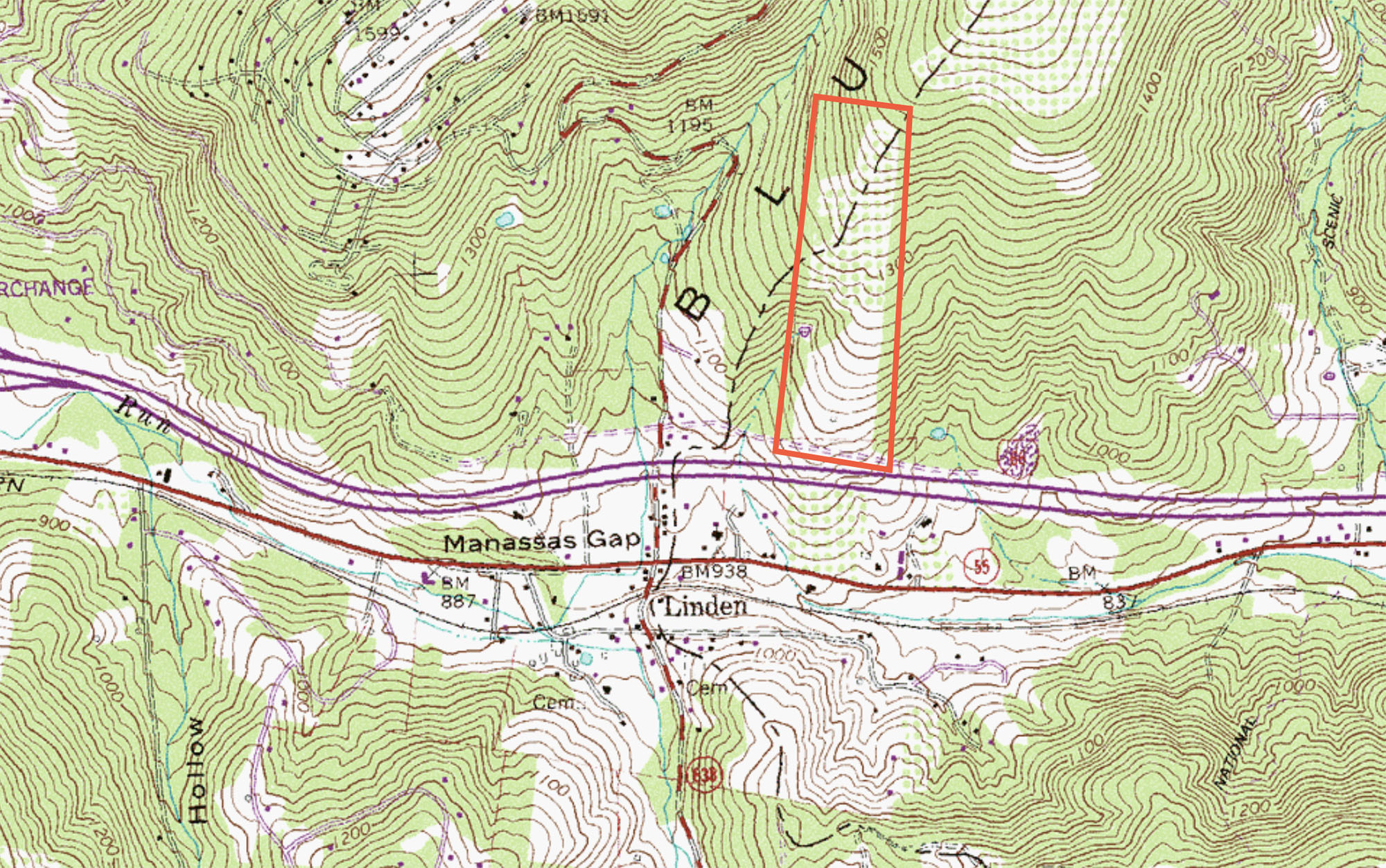
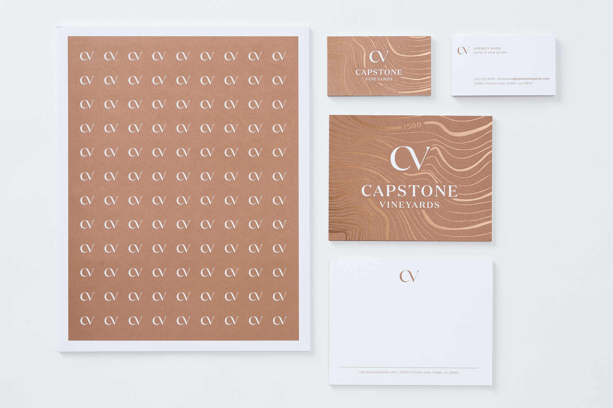
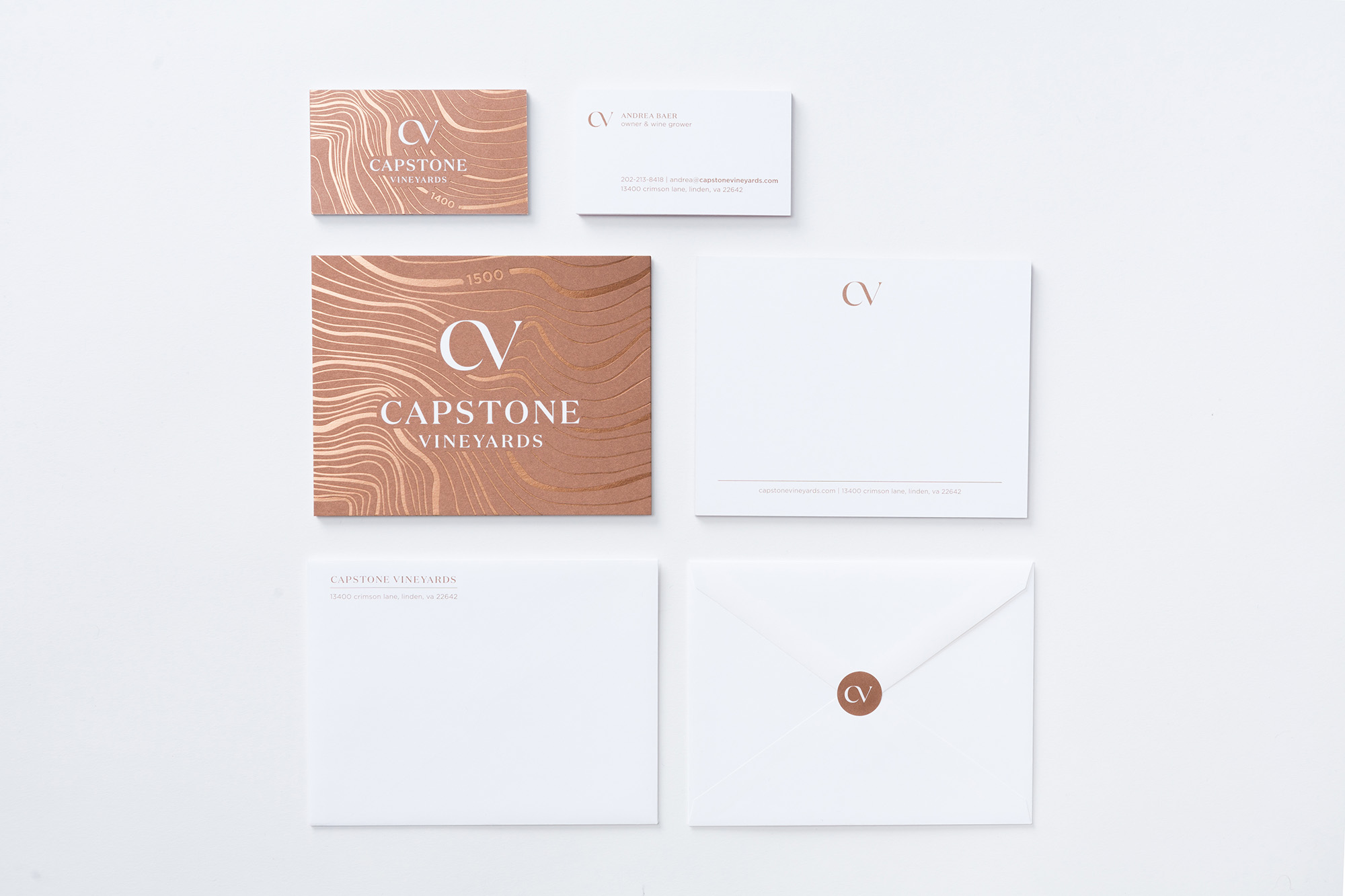
The main design of the identity focused on a simple, organic connection between the C and the V with supporting elements that reinforced the importance of the land. The topography lines became backgrounds for labels that highlighted the part of the vineyard where that wine was grown. Copper ink and foil were used to connect the identity to the earth and bring a subtle refinement to the pieces.
Work done at General Design Co.
- Design
- Identity
- Packaging